System windows controls label
Windows Controls: The Label
Introduction to Labels
 from the Toolbox and click the object that would host it.
 Topic Applied: Introducing Labels
- Start Microsoft Visual Studio
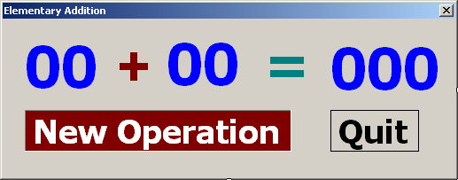
- Create a Windows Forms Application named ElementaryAddition1
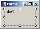
- From the Common Control section of the Toolbox, click Label and click the form
- From the Common Control section of the Toolbox, click the Label again and click the form
- From the Common Control section of the Toolbox, click the Label again and click the form

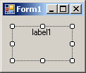
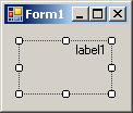
- On the form, click the first label
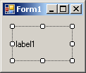
- In the Properties window, click Text and type 00
- Click (Name) and type lblOperand1
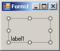
- Click TextAlign and the arrow of its combo box to select MiddleCenter
- Click the + button of the Font field and change the characteristics as follows:
Name: Tahoma
Font Style: Bold
Size: 48 - On the form, click the second label and, in the Properties window, change its characteristics as follows:
Text: +
TextAlign: MiddleCenter
(Name): lblOPeration
Font -> Name: Arial
Font -> Font Style: Bold
Font -> Size: 48 - On the form, click the third label and, in the Properties window, change its characteristics as follows:
Text: 00
TextAlign: MiddleCenter
(Name): lblOperand2
Font -> Name: Arial
Font -> Font Style: Bold
Font -> Size: 48
- Click an unoccupied area of the form and press Ctrl + A to select all three labels
- In the Properties window, double-click AutoSize to set the value to False
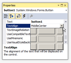
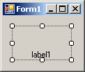
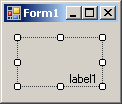
| TopLeft | TopCenter | TopRight |
 |  |  |
| MiddleLeft | MiddleCenter | MiddleRight |
 |  |  |
| BottomLeft | BottomCenter | BottomRight |
 |  |  |
- Complete the design of the form as follows:

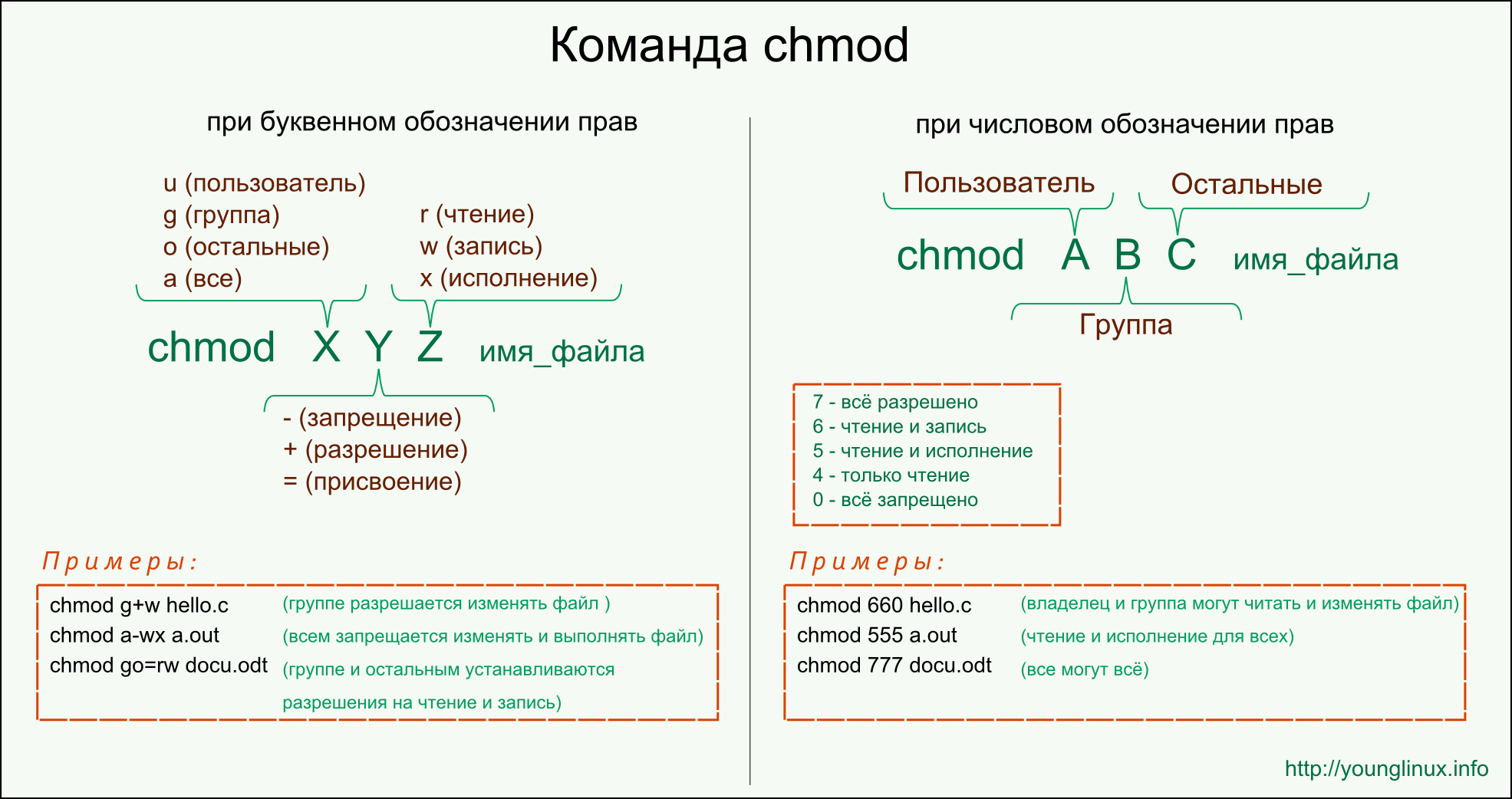
Control Text Name TextAlign Font Additional Properties Label 00 lblOperand1 Center Name: Tahoma
Font Style: Bold
Size: 48ForeColor: Blue Label + Center Name: Arial
Font Style: Bold
Size: 48ForeColor: Maroon Label 00 lblOperand2 Center Name: Tahoma
Font Style: Bold
Size: 48ForeColor: Blue Label = Center Name: Arial
Font Style: Bold
Size: 48ForeColor: Green Label 00 lblResult Center Name: Tahoma
Font Style: Bold
Size: 48Label New Operation lblNewOperation Center Name: Tahoma
Font Style: Bold
Size: 28BorderStyle: Fixed3D
ForeColor: White
BackColor:MaroonLabel Quit lblQuit Center Name: Tahoma
Font Style: Bold
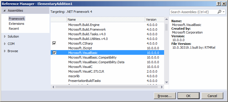
Size: 28BorderStyle: FixedSingle - To be able to use the Visual Basic library, in the Solution Explorer, right-click References and click Add Reference.
- In the Reference Manager, click the chek box of Microsoft.VisualBasic
 |
 |
 |
 |
 |
Labels and Data Record Selection
Text-based controls are the prime candidate for showing the value of a column of a table. Probably the simplest way to do this is by assigning a value gotten from a SQL data reader. Here is an example:
An alternative is to use the Binding class. In this case, you must access the DataBindings property of the label and call the Add() method of the property. In the parentheses, use the primary constructor of the class to pass the Text property as a string, the index of the first table of the data set, and the name of the column of the table. This can be done as follows:
Label. Target Свойство
Определение
Получает или задает элемент, который получает фокус, когда пользователь нажимает клавишу доступа метки. Gets or sets the element that receives focus when the user presses the label’s access key.
Значение свойства
Элемент UIElement, который получает фокус, когда пользователь нажимает клавишу доступа. The UIElement that receives focus when the user presses the access key. Значение по умолчанию — null . The default is null .
Примеры
В следующем примере показано, как задать свойство Target объекта Label. The following example shows how to set the Target property of a Label.
Комментарии
Вы можете указать сочетания клавиш для элементов, которые не поддерживают ключи доступа, указав Label ключ доступа и установив это свойство. You can provide keyboard shortcuts to elements that don’t support access keys by giving a Label an access key and setting this property. Присвойте метке ключ доступа, поместив знак подчеркивания непосредственно перед символом, который выступает в качестве клавиши доступа. Assign an access key to a label by placing an underscore immediately before the character that acts as the access key. Ключ доступа можно указать в Content свойстве или с помощью параметра Content для AccessText объекта. An access key can be specified in the Content property or by setting Content to an AccessText object.
Это свойство нельзя использовать для определения UIElement . You cannot use this property to define a UIElement. Например, следующий код компилирует, но не работает: . For example, the following compiles but is not functional: . Это свойство предоставляет ссылку на элемент, который уже определен в приложении. This property provides a reference to an element that is already defined in your application.
Сведения о свойстве зависимостей Dependency Property Information
| Поле идентификатора Identifier field | TargetProperty |
| Свойства метаданных, для которых задано значение true Metadata properties set to true | Нет None |
Использование атрибута XAML XAML Attribute Usage
Использование элемента свойства XAML XAML Property Element Usage
Значения XAML XAML Values
nameOfExistingElement
Имя UIElement , которое получает фокус при нажатии клавиши доступа. The name of UIElement that receives focus when the access key is pressed.